Would you believe a small icon can make a big difference in your business's impact and impression?
In the crowded B2B SaaS market, your logo is your first chance to make an impression. Done right, your logo sets the stage for your brand’s credibility, memorability, and growth potential.
Think about iconic SaaS logos like Salesforce or Slack. These are visually appealing and communicate trust, innovation, and professionalism. A strong logo helps your company stand out, creates an emotional connection with your audience, and lays the foundation for a consistent brand identity.
Unfortunately, many SaaS founders fall into three common pitfalls when designing their logo:
- Underestimating its impact: Opting for a safe, uninspired design that fails to differentiate their brand.
- Overcomplicating the message: Trying to cram too many ideas into one logo, resulting in a cluttered, ineffective design.
- Ignoring alignment with the visual brand: Treating the logo as a standalone asset instead of integrating it into a cohesive brand system.
Avoiding these mistakes can transform your logo from a simple mark to a strategic tool for growth. At Kalungi, we use five core criteria to design logos that deliver impact, scalability, and memorability:
- Impact
- Versatility
- Memorability
- Technicality
- Designing for systems
Let’s dive into these criteria and explore how the best SaaS logos are designed to stand out and succeed.
5 Criteria Used By The Best B2B SaaS Logo Designers
The best B2B SaaS logos are strategic assets that meet specific design standards to ensure they stand out and drive results.
Here are the five essential criteria to keep in mind:
Criteria #1: Impact
First impressions are everything.
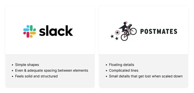
When you are navigating the sea of logos in the B2B SaaS market, the logos that grab your attention are usually the more simplistic ones because they look more credible and professional.
Take a look at the two logos below for example.
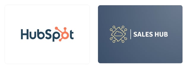
The left logo looks far more credible than the right logo. It is simple, modern, bold, and instantly recognizable due to the way the icon is integrated into the word mark.
On the other hand, the right logo uses literal imagery and is overly complex, so it blends into the logos that also use similar imagery and does not elicit a strong first impression.
The reality is, people will not take the extra time to decipher what overly complicated logos are trying to communicate. Simplicity resonates faster and more effectively with your audience. They look for logos that give them a positive emotional response.
A good logo focuses on being a brand identifier rather than trying to carry the full weight of a brand’s message. Brands should spend less time and effort trying to cram meaning into the logo and more time figuring out how to elicit an impactful emotional reaction with it.
Criteria #2: Versatility
If your logo imagery is too literal or specific to your industry or offering, it restricts your company from expanding in the future and may isolate or exclude some of your potential ICPs.
This may be fine in the short term but in the long term you may need to pivot your branding if that imagery no longer fits your product offer and no longer appeals to your audience.
Instead, it’s best to stick with a design that, while still representing your brand, is vague enough to allow you to expand your business over time without the need for a major rebrand.
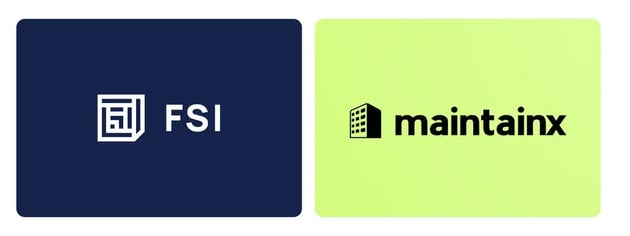
For example, if you are a facilities maintenance company that started out with hotel management you will always be associated with hotels if you use that imagery in your logo like the right image. Whereas if you have a vague but unique icon from the beginning, it keeps your possibilities open for the foreseeable future like the image on the left.
Generic imagery will also make you disappear and be less memorable in a sea of competitors who may also use the same imagery in their logo. Therefore, a good strategy is to strive to look like an industry leader. Be different, be bold; simple but memorable.
Keep in mind, however, that while you should strive to be unique, you need to be aware of the logos and bands in your industry. While it may be impossible to create a completely unique logo, if you can stand out from your competition, you are on the right track.
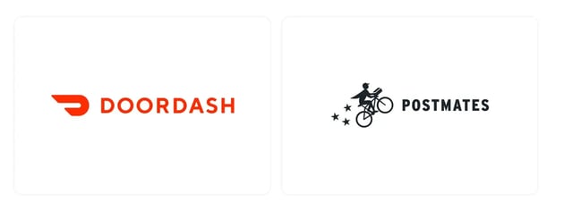
For example, the left logo above uses imagery that is completely outside of the industry which makes it stand out against the competition more than if you used typical imagery like the one on the right.
Criteria #3: Memorability
A successful logo allows the audience to instantly associate it with a brand the moment they see it.
A common mistake companies make in order to differentiate their logos from competitors is to add a bunch of details to try and make a grand statement. However, it is likely that our brains will not remember those details because we can only retain so much information at a time.
Therefore, creating a simple logo helps remove details that don't hold value so that there is less visual information to retain thus making the logo significantly more memorable.
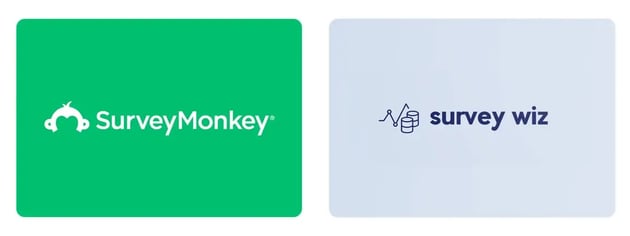
As you can see, the logo on the left is arguably more memorable because it has fewer elements for the brain to memorize which makes it easy to instantly recall when you see the symbol paired with the brand color.
The logo on the left has so many elements to it that functions more as an art piece than it would as a logo. The complicated imagery makes it harder to associate with a specific company when seen alone, especially because it also is not paired with a brand color.
Criteria #4: Technicality
Because the brand presence of a SaaS company is so largely online, it’s crucial that your logo can be adapted to fit many types of digital assets and screen sizes. For this purpose, having a logo that is widely scalable is essential.
More simple shapes and designs logos translate much better on-screen and print because they maintain their integrity when scaled down to a very small size. Having a technically sound logo helps create a more professional-looking website for desktop and mobile.
A rule of thumb when creating a technically sound logo is to do the squint test. Scale the logo down, sit a distance away from the screen and squint your eyes. You should still be able to register your logo when you squint. If any details are lost, it is best to cut them out of the design.
Here are a few more best practices for creating a technically sound logo:
- Avoid fine lines
- Avoid small details
- Avoid using too many colors. Stick with 2-3 colors.
- Avoid complex imagery
- Avoid loose or floating elements—keep everything contained in one symbol
Criteria #5: Designing for Systems
Designing with the intention of creating a system is what separates good brands from great brands.
That’s why, when I am designing a logo I am also thinking about ways to incorporate a design system. The design system governs how each brand element works together to tell a visual story effectively with impact.
When a logo is well done, we can use elements within the logo to create patterns, graphics, and more, to create a cohesive brand that looks like they all belong together. This in turn governs how fonts, colors, buttons, icons, and layout grids of a website will look.

When thinking of a design system, the concept of "less is more" will be your best friend. The strongest brands have simple yet unique logos with only a couple of core brand elements that tie them all together. It's imperative not to have too much going on because that will muddy the brand's identity.
When you keep your logo simple, you are setting up the rest of your brand for success.
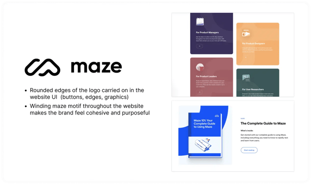
The design system is especially useful for your front-end developers and product managers to keep your website and software looking cohesive. This will be important when you are trying to stand out and capture your audience's attention.
Your audience will perceive your brand as more credible and professional the more cohesive it looks.
This credibility is very important for B2B SaaS companies as they need to look cutting edge in order to gain attraction in the saturated market. You can imagine how much better it is to have a brand that has elements that work well together as opposed to one that has a bunch of different elements trying to look cohesive.
A great example of where this is useful for B2B SaaS companies is when you have more than one product under your umbrella. With a logo system, you are able to create multiple logos for each of your solutions that all look like they belong together. That way, people can recognize your product and associate it with your brand.
To recap, the best SaaS logos are impactful, versatile, memorable, technically sound, and designed as part of a cohesive brand system.
Simple Tips for Creating a SaaS Logo
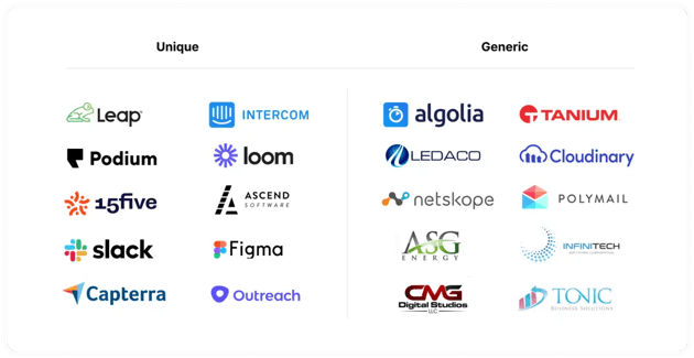
Be unique—don't be generic. Watch out for obvious imagery that will isolate your other ICPs.
When ten of your competitors have car imagery for their logos, don't add another car to the scene. Make your logo stand out by abstracting a concept that appeals to an idea, a feeling, or a story. Make sure you choose one idea, not ten.
When you try to do too much and pack too many concepts into a logo, it starts to become more of an illustrative piece rather than an actual logo. Your logo should serve as an identifier and mark, not as a symbol that tells the whole story so don’t get too tied up on making your logo perfect.
While the logo is an important identifier, it is also only one small piece of what makes a great brand. It is how you represent the rest of your brand that helps you tell your story. Read more about this in our other blog Your B2B brand strategy needs more than just a logo.
Take risks! Don't be afraid!
Choosing the safe option is easy because it has been done many times before. In many cases, however, your most powerful contender is the one you're afraid to pick at first. Successful logos become iconic over time as your company builds credibility and presence.
So with all that said, are you ready to make the change and create a powerful brand? Here is a resource on how to successfully rebrand a company to get started.
Common SaaS Logo Design Mistakes to Avoid
Your logo is one of the most visible representations of your company—getting it wrong can have long-term consequences. Here are some common mistakes SaaS companies make when designing their logo and how to avoid them:
- Overcomplicating the design: Too many details can overwhelm your audience and make your logo less effective at smaller sizes.
- Chasing trends: Trendy logos age quickly. Focus on timeless design principles for longevity.
- Ignoring your ICP: A playful logo might appeal to SMBs but alienate enterprise clients. Make sure your design aligns with your target audience.
- Being too literal: Avoid overly specific imagery that limits your growth potential.
By avoiding these pitfalls, you’ll set your logo—and your brand—on a path to success.
SaaS Logo Success Stories by Kalungi
We’ve helped countless B2B SaaS companies create logos that not only stand out but also align with their brand vision and business goals. Here’s one example to inspire your next logo design:
Degrees of Change: Aligning Vision with Identity
Challenge: Degrees of Change, a mission-driven organization empowering students through equity-focused SaaS tools, needed a rebrand that reflected their innovative solutions and broad social impact. Their previous logo failed to capture their forward-thinking mission and lacked the versatility needed for digital platforms.
Solution: We designed a logo system that combined sleek, modern aesthetics with a visual narrative representing progress and connection. The design utilized clean, scalable elements that could seamlessly adapt across platforms, ensuring a cohesive brand presence.
Results: Post-rebrand, Degrees of Change achieved a more unified identity across their digital properties, increasing their brand’s credibility and enabling them to expand their impact within their target audience. Their updated logo resonated deeply with their stakeholders, reinforcing their mission while positioning them as industry leaders.
OCC: A Bold Visual Statement
Challenge: One Click Contractor, a SaaS solution for residential construction estimating, needed a visual identity that matched their cutting-edge approach to streamlining sales processes, finances, and project management. Their existing logo was outdated and failed to convey their expertise or resonate with their target audience of contractors and home improvement professionals.
Solution: As part of a larger rebranding effort, Kalungi designed a modern, professional logo that reflected One Click Contractor’s innovative spirit and commitment to simplicity. The logo featured clean lines and bold typography, balancing technical precision with approachability—essential qualities for their ICP in the home improvement industry.
Results: The new logo, alongside the website redesign and content strategy, was pivotal in achieving significant business outcomes:
- 12.5% increase in organic user sessions.
- 164% surge in organic marketing-qualified leads (MQLs).
- 37% rise in email subscribers.
The redesigned logo helped establish One Click Contractor as a credible leader in the residential construction SaaS space, reinforcing their value proposition and driving engagement across digital platforms.
Degrees of Change demonstrates the importance of a logo system (Criteria #5), while One Click Contractor illustrates the value of versatility and technicality (Criteria #2 and #4).
Your SaaS Logo Is Just the Beginning
A great SaaS logo is a powerful tool—but it’s only one piece of your brand puzzle.
To truly stand out in a competitive market, you need a cohesive visual identity, consistent messaging, and a marketing strategy that brings everything together.
Your logo may grab attention, but it’s the experience you provide that turns attention into trust, and trust into long-term loyalty. That’s why investing in your brand holistically is essential.
Ready to Build a SaaS Brand That Stands Out?
At Kalungi, we specialize in helping B2B SaaS companies create impactful logos and comprehensive brand strategies tailored to their unique needs of SaaS brands. Whether you’re starting from scratch or rebranding for growth, we’ll guide you every step of the way.
📩 Contact us today to schedule a consultation and start building your SaaS company logo—and a brand—that resonates with your ICP and drives your business forward.
What to read next:
Additional articles related to rebranding your software company: