The essentials of B2B SaaS branding and rebranding
In this video, B2B SaaS CMO Adriana Rubio walks you through the best practices and practical tips for forming your brand or launching a rebrand.

Kati Keilty
Branding breathes life into a company. It’s what distinguishes you from your competitors and what makes you recognizable to your customers. Your brand tells a story of who you are and what you stand for as a business. Branding is so much more than just a logo, it’s how potential and existing customers feel about you and your products/services and is an essential component of your B2B SaaS design strategy.
Many SaaS company founders get held back trying to design the perfect logo for their company. We’ve even worked with a few founders who let their personal connection to the company get in the way of building more important pieces of their marketing engine. Equally, on the other end of startups, founders of well-established companies that are in need of a rebrand to modernize their existing identity and logo, have had difficulty parting with a design that is outdated because of personal attachments. Overall, it has led to experiences with some founders who delay large projects like a website redesign to prioritize back and forth.
While it’s understandable that founders often campaign for a logo they feel perfectly embodies their product, your logo is only a small piece of a successful brand strategy–especially as an early-stage company.
As a young company, it’s often not worth the time and energy to craft the perfect logo. The most important components of your logo at the beginning are that:
It’s important to also note that nothing is permanent, especially for young companies. A logo change or rebrand can happen in the future when the time is right for your business. Getting established with your ideal customers is of greater significance at the start.
With your ideal customers having the autonomy to choose which brands they spend their attention and money on, it’s vital that you have a B2B SaaS brand strategy that will showcase your company ethos and the principles on which you stand.
When looking at what makes certain brands successful and their ability to withstand the test of time, there are key components to developing who your brand is:
It’s in our nature as humans to want to feel a connection to others. Storytelling is a social and cultural activity that is also a very powerful communication tool. In terms of branding, it focuses the narrative around your ideal customer, rather than on the company or product.
Storytelling connects your audience to the values that your brand stands for. For example, Nike utilizes this method very well. They make their brand story relatable to the masses; whether that be the struggle to push yourself to workout, the elation in scoring the winning goal for your team, or the disappointment in letting your team down.
People become invested in the Nike brand because its values are sold to consumers in a way that makes people feel connected to the brand through their own experiences.
The reason storytelling is so effective is that it is subtle. It humanizes and interweaves who a brand is without forcing it upon customers. Without realizing it, people have developed certain positive connotations about your brand and in the end, that’s how they will recall who you are.
Though Nike is a B2C company, this same methodology can be readily applied to B2B branding. In the end, you are marketing to people, not companies, and building a story in this same way will be just as effective at establishing a strong brand perception among them.
Your brand in its entirety, if designed well, should evoke a feeling in your ideal audience about what you provide as a company and how they fit into that narrative.
Start by considering what makes your brand unique. Returning to the Nike example, there are a vast amount of fitness and sneaker brands that exist. Therefore like Nike, you have to utilize your foundational brand ethos by forming them into a story that customers can relate to and sympathize with. This is what will make you stand out amongst your competitors in your niche and better position yourself against them.
B2B brand language uses a combination of graphic elements such as color, typography, shape, photography, and pattern to illustrate the values of a brand visually. These elements are what make your brand consistent across a variety of different mediums, from print to digital marketing.
The strategy of designing the graphic elements of your brand must align to your overall values, or else it could be detrimental to how your company portrays itself. The impression your brand makes to your audience happens in seconds and then must be lasting and uniform across multiple different touchpoints.
While your logo or signifying icon is what customers will most easily associate with your brand, it’s the full package of graphic elements that really creates a unique tone of voice and visual language.
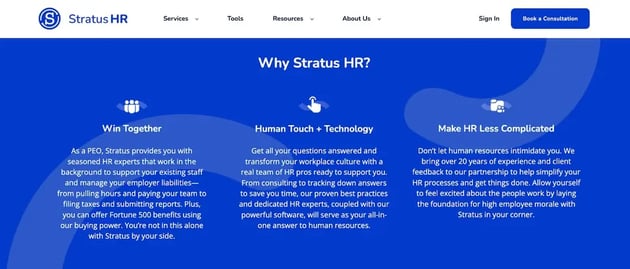
For example, the B2B human resources company, Stratus HR utilizes the circle shape to highlight individuals to express their fundamental value of being a people-driven company. The circle also represents the partnership and interworking relationship between clients and Stratus. The graphic elements further enhance these ideals, while the color scheme of royal blue and bright blue makes the brand feel sophisticated and, at the same time, approachable.
Here's a strong example of graphic language in action:
.webp?width=600&height=277&name=stratus%20hr%20b2b%20branding%20strategy%20website%20example%20(1).webp)

Utilizing strategic graphic elements helps tell the overall brand story and paints a picture for your audience of what exactly your brand stands for and is trying to communicate.
Make sure to always have a solid strategy and reasoning behind your color choices and representation of graphic elements, otherwise, the brand will feel misaligned with its overall purpose.
If you’re still in the process of developing your brand’s identity and tone, try our quick branding exercise with your team to get a better sense of what precisely about your company your brand should be projecting
The phrase “consistency is key” couldn’t be more accurate when it comes to your brand. Consistency across your design, as well as across your messaging. It allows you to have a strong footing in your niche market area.
Consistency develops a trustworthy relationship with your specific target audience. Particularly when it comes to B2B brand identity, in markets where large deal sizes make trust a critical factor, this trust is essential.
With most branding existing primarily online, especially in the scope of SaaS marketing, it is imperative that your branding elements are adaptable and consistent across multiple digital touchpoints. A functional and impactful website design will be one of the first indicators to potential ideal customers of whether you are the right fit to help fulfill their needs. Accessible and intuitive UI design across your company’s product will also signal whether or not you can be seen as being a credible expert in your niche area.
All of your touchpoints should feel on-brand and align with other marketing assets such as content. Providing customer testimonials is a great example of linking content into your website design to help showcase your consistency as a service provider.
Brands that are inconsistent and misaligned between their design and values will be seen as illustrating a false narrative and being unreliable. An example of this concept is Meta, or previously known as Facebook.

The social media platform recently underwent a brand name change to signal its transition into the world of virtual reality. However, while their mission statement is “giving people the power to build community and bring the world closer together”, they have been swirled in negative press for years.
Whether it be their ability to: spread misinformation like wildfire, incite hate speech, the invasion of privacy, or helping to crumble the self-esteem and mental health of young people, it’s difficult to cover all of that controversy under a new name. Your purpose and values need to be integrated throughout your brand; otherwise, you could risk being portrayed as deceitful by your audience.
Developing a brand style is a sure way to help maintain consistency, especially for a new and growing company. Brand guidelines are like the constitution for the overall identity. They outline the rules for how the brand should be represented across all mediums but allow for some creative autonomy within those guidelines.
For a startup, providing enough detail to create brand alignment is necessary. Introducing who the brand is and your core values and providing information on how to use the logo, color palette, typography, and imagery, are all components that are needed for a basic brand style guide.
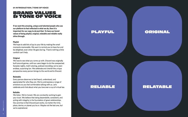
Discord's brand style guide, for example, provides a succinct summary of the tone that they want to project, including descriptions of each core brand word.

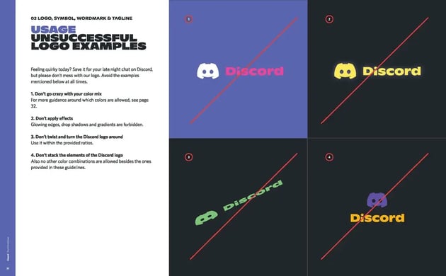
They also include, accompanied by visual examples, specific instructions on how to use and not to use their brand logo. It's best to be as specific as possible here to avoid inconsistencies wherever possible.

As you grow into a larger company, a more finite and granular explanation of when and how to use the branding elements may be necessary to ensure complete adherence to the guidelines.
However, I believe there always needs to be room for creatives to utilize the existing rules to develop new concepts and solutions. A style guide should be just that – a guide. Being too restrictive can limit the possibility of creating new and even better design deliverables.
Humans in general also crave routine and familiarity. If your company can consistently deliver on the promises of your brand, you will develop deep, loyal relationships with your audience and they will become unwavering patrons.
With so much information flying at us every day through the internet and social media, your brand has to gleam a bit brighter than others in order to stand a fighting chance at winning over your target audience. Behind your logo is a brand story. Make that story known to the masses through all of your branding touchpoints, while being intentional and consistent in your design and messaging.
Want a brand that actually stands out and sells? Kalungi’s B2B SaaS design services help you build a visual identity that’s consistent, compelling, and conversion-ready.
Additional articles related to rebranding your software company:

In this video, B2B SaaS CMO Adriana Rubio walks you through the best practices and practical tips for forming your brand or launching a rebrand.

Get your B2B SaaS company in front of the right customers with multi-channel marketing. Drive growth and establish your brand as an industry leader.

A solid B2B SaaS design strategy for connecting with your audience will help align your brand across all touchpoints and create a trusting...
