Strategy & Planning
4-step company branding exercise [template included]
Use this Template for company branding exercises with your team to establish your current Brand Identity and Brand Aspirations. Our branding exercise...


Linda Luu
Your brand colors are an integral part of your brand. They are a crucial component in how you communicate your brand story and cultivate brand recognition and associations. In order to make the strongest impact on your audience, your brand colors need to spark an emotional response, reflect and communicate your brand’s voice, and be memorable.
A common mistake I’ve seen when rebranding B2B SaaS companies is the use of too many colors that do not effectively communicate a brand's story or a lack of effort put into creating a color palette that essentially makes it seem like they do not have a brand at all. This can significantly decrease the credibility of your company and audience engagement.
Making this first impression is super important for SaaS companies as you are trying to grab attention and convince the audience to learn more about your service. Your audience will be looking for a company that looks modern, trustworthy, tech-savvy, and innovative. This will be communicated through your logo design and brand colors. That is why it is worth learning how to use color theory to shape your audience's mood and perception if you want to create a strong, impactful first impression.
Here are a few tips to consider when choosing brand colors:
What is your brand’s voice and what are you visually trying to communicate? Take into consideration your brand words, brand message, and target audience. This will dictate the direction of your brand color pallet.
Is your company friendly, approachable, people-centric, and relatable? Then you would likely go for a lighter or brighter color palette that evokes this emotion. Take Asana, for example, they are a people-centric brand so their brand colors reflect warmth and creativity.

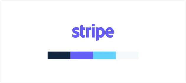
If you are a new cutting-edge tech start-up that’s really going for an audience of innovators and early adopters, you may want to choose bold, bright, and exciting colors to capture your audience's attention. Take Stripe’s color palette, for example, if you visit their website you can see that they instantly grab your attention with color gradients that make them look and feel very modern and seem very “new age tech.”
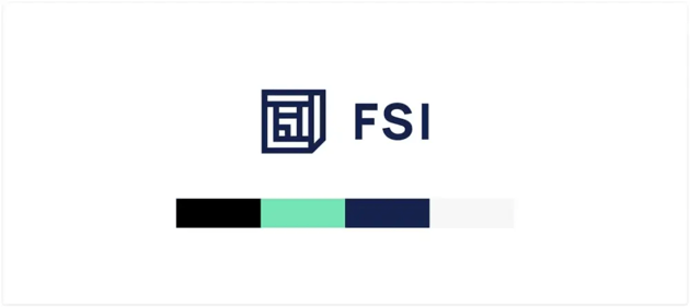
Or are you a bold, innovative, authoritative, seasoned industry leader? In this case, you would go for a bold, refined, or simple color pallet. Take FSI’s brand, for example, they have been in the industry for a long time and communicate that through their brand colors with a more toned down, formal, and refined palette that appeals to older generation facility managers.
Think about how color psychology comes into play when trying to elicit a certain emotion from your audience. This can be a powerful tool to really dive in deep with your target audience.
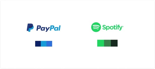
For example, cool tones like the color blue and purple give you a sense of security and relaxation. It is often associated with being trustworthy, stable, dependable, reliable, and intelligible. This is why many companies default to the color blue. For SaaS companies, this works well as it can communicate a smooth user experience or a seamless and hassle-free service.
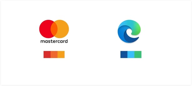
Brighter colors like red communicate excitement, passion, energy, boldness, power, fearlessness, and life. It is a color that intensifies reactions and is connected to the human body and emotions. That’s why many healthcare, food, sports and lifestyle brands use this color.

Green or teal communicates growth, safety, youth, life, and balance. It is associated with new beginnings, is very human-centric, and is approachable.

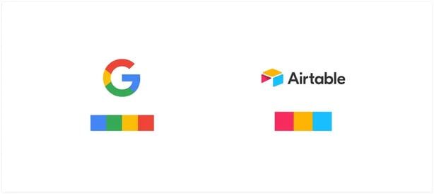
To create a strong brand, you really only need 3-4 colors. Any more than this will dilute your brand identity and make it harder for your customers to recognize you. Strong brands have a combination of colors that are instantly recognizable to the audience, often without text or a logo. For example, when you see blue and yellow together it reminds you of IKEA.

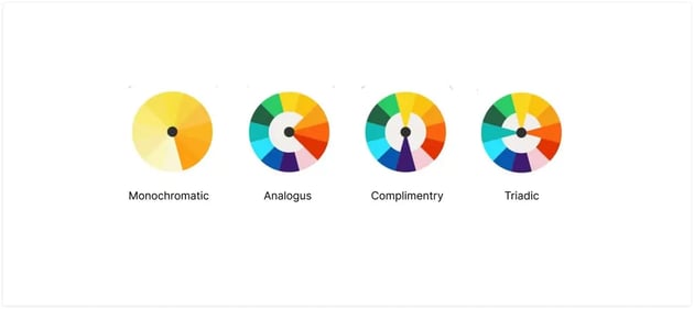
It is important to choose a strong color palette in order to make an emotional impact. When picking colors I usually will follow three criteria:
When choosing your colors make sure it fits within these four types of color palettes. You can test out your own color palette using this tool.

Looking at the colors of your industry and competition will help you gain some insight on what’s working, why, and how you can approach the market at a different angle.
With so many brands available on the market, it may be very difficult to come up with a completely unique color pallet. If you strive to stand out from your top 5+ competitors in some way then you are on the right track. It is also worth noting that it is okay to have a color scheme that might be similar to another brand, as long as they are not in direct competition with you.

Emotions are powerful and every color has an emotion. That’s why choosing the right brand colors is so important because it is what triggers an emotional response from your audience. Don’t be afraid to explore outside of the conventional blue pallet. The strongest brands utilize bold color pairings to help tell their brand story. This is what separates a good brand from a great brand.
Want help picking colors that actually convert? Kalungi’s B2B SaaS design services turn strategy into visual identity that sticks.
Learn more about how to create a strong B2B SaaS brand with these articles:

Use this Template for company branding exercises with your team to establish your current Brand Identity and Brand Aspirations. Our branding exercise...
Get your B2B SaaS company in front of the right customers with multi-channel marketing. Drive growth and establish your brand as an industry leader.

A B2B SaaS brand is so much more than just a logo, it’s an identity that breathes character into your business. Learn the key strategies for how to...