Strategy & Planning
Setting Your B2B SaaS Marketing Budget? Answer These 3 Questions First
Set your B2B SaaS marketing budget with confidence. Discover 3 must-ask questions that help you align spend with revenue goals and strategy.


Kati Keilty
With almost everything being conducted online, the conversation between brands and users has been put on a global scale. A global community has been created that is all about engaging with current and potential customers and critics on every level of communication. Therefore, even though there is a vast amount of audience to market to, it is imperative to know who you are trying to reach and focus on that specific group to gain traction within the marketplace. One of the best ways to accomplish this is through design.
A solid B2B SaaS design strategy for connecting with your audience will help align your brand across all touchpoints and create a trusting relationship with your audience. Here are our top five insights on how to do so:
Before starting to build out your brand or any important design pieces, the first question to address is, “who am I trying to reach”? While there are millions of potential customers out there, many of them will not be an ideal fit and stretching and diluting your brand and resources to reach all of them would be inefficient and ineffective.
It is vital to understand the niche area you can inhibit as an expert in the marketplace. Having a well-defined ideal customer profile (ICP) allows you to create your design strategy targeted exactly on who you know will interact with your brand and products; become the ideal brand for your ideal customer.
Digging deeper into your intended audience's demographics will help you to understand who it is you’re designing for. Who are they? What approximate age are they? Where are they from? The more information you know about them, the easier it’ll be to define your strategy on how to best design your brand to cater to their needs and wants.
A great way to do this is to put yourself in their shoes. Create user personas that encompass different personalities, ages, and job titles. This will help you work through how exactly these users would interact with your brand and products. What day-to-day issues do they experience that your service can solve? What are they hoping to achieve in their work? What would make their jobs/lives easier? What pains, claims, and gains should you speak to? Designing for your user is how you will attract and keep consumers that fit your ICP.
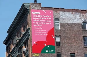
To see an example of a brand that illustrates that they truly know and understand its audience, let’s look at Spotify's user-generated content campaigns. They utilized a strong copy-led strategy to reach their vast global audience through humor and irony, which are relatable to us all. They use a bright, fresh color palette that expresses the vibrancy of different genres of music in combination with actual user data to make it known to their audience that Spotify not only understands them but is paying attention to you.

Once you have defined your ICP, it will be much easier to nail down your design strategy. You will have a clear idea of why you want to use a certain color palette, typeface, and photography/illustration style because you will know your audience’s likes and needs.
A value proposition is an easy-to-understand reason for why customers should buy your product or service. It is a promise of what you will uphold as a brand. Building your B2B design strategy around these values will help visualize to customers what makes you stand out amongst competitors.
Your brand should illustrate who you are as a company through its identity. Do you value flexibility, trust, approachability, and being a people-centric brand? If so, does your design communicate all of those characteristics? Does your color palette align with your industry as well as your company ethos? Does your photography or illustration style feel relatable to your ideal customers? These are all aspects to consider when designing your brand to align with the promises you stand behind.
A great example of a brand that reflects its value propositions within its brand identity and design is Innocent Drinks. They are a UK-based company that makes smoothies, juices, and sparkling drinks out of freshly pressed fruits. Their promise to deliver a product that is nutritious and honest is reflected in their transparent and simple ingredients.
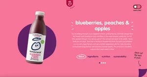
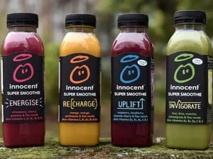
They are also big proponents of being a purpose-driven brand. This is a value proposition that is executed through their promises to do better for humans and the planet. They deliver on these promises by recycling, using 100% sustainably sourced ingredients, becoming a carbon-neutral company, and donating to charities.
It’s not enough to state what value you offer clients, you need to follow through and deliver on those promises.
Research, research, research. Before you can create a strategic approach to your design, you need to know what others in the same market are doing. If a direct competitor utilizes a blue color palette, it would be unwise to also use blue. You need to stand out. The only way to do that is to know who your competition is and what they look/feel like.
It is also okay to borrow from these competitors. If there is something you see that they do extremely well that is attracting the same customer base you are looking for, take a similar approach, but make it your own. The whole point is not to copy them, but instead, see how those principles could be implemented into your own design.
Pinpoint what your ICP isn’t getting from your competitors, what makes you different, and why they should pick you over the competitor. Utilize what makes you unique as a brand in your design, it’s what will ultimately make you stand out.
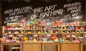
For example, let’s look at Lush. It’s a fresh cosmetics brand that makes products using only natural ingredients. In comparison to its main competitor, The Body Shop, which uses a natural and muted color palette in its products and branding, Lush stands out by using bright, funky colors and a bold, handwritten typeface to appeal to their audience. While at face value, both companies are natural cosmetic brands, Lush stands out by being more attention-grabbing and making their products feel fun.

The identity of your brand determines how the brand expresses itself. Your brand identity and voice are what give your company personality and maximize on human nature's need for connection. We all strive to feel understood and seek out people and products that we can relate to. The personification of your brand helps you to understand exactly who you are and therefore, how to illustrate those ideals through design.
Tone is another characteristic that makes your brand feel more human. It is distinguishable to your audience and makes your brand easy to identify. In a cohesive brand experience, your brand’s tone and design will be complimentary. For example, if your brand uses language that is more tongue-in-cheek, your identity may have a more bold and playful color palette as well as a heavier-weight typeface that feels impactful and attention-grabbing.
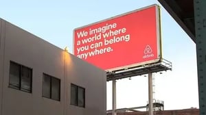
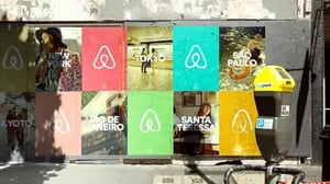
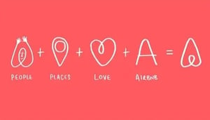
AirBnB is a great example of a company that has a complementary design system to match its brand voice. Their bright color palette and photography style are inclusive and reflective of the numerous global destinations you can make your home for a short period of time. They make you see yourself in their brand through their design and tone of voice.
It is also important in your overall design to be conscious of the industry in which you inhabit. Certain colors and styles will be more relevant depending on who you are designing for. Companies in the tech sphere will appear very different from those in construction.
For example, the eCommerce brand Shopify Plus utilizes a black and green color palette that speaks to its sophistication and being more elite than its sister company, Shopify. The green signifies growth, renewal, and abundance.
Comparing this example to one from a different industry, the B2B SaaS company Aware 360 uses a blue and orange color palette. They provide safety solutions to their customers and capitalize on the trust and reliability that blue offers while using orange to feel approachable and relate to their customer base of hands-on construction workers.
The strategy behind why you choose certain colors, typography, and photography styles is integral to delivering your brand promise and illustrating who you are as a company.
Know your audience. You can’t attract and keep customers without first knowing who they are and what their needs are. Once you have your ICP nailed down, build your design strategy around creating a humanized brand that has an emotive connection to your audience. People are more likely to attach to a feeling as it feels relatable rather than to something intangible like a solution or service.
Your designs should all relate back to your underpinning strategy, otherwise, you risk coming across as misaligned and untrustworthy. In B2B SaaS marketing, it is of vital importance to be the exact opposite of those characteristics. Your design strategy can help you illustrate exactly who you are, and who you will attract.
To get started, consider taking a look at these articles on developing your logo and brand identity to help you through the process.

Set your B2B SaaS marketing budget with confidence. Discover 3 must-ask questions that help you align spend with revenue goals and strategy.
Syndicate your existing B2B or B2C content with 4 easy steps to increase your company's visibility, site traffic, and customer retention.

Discover some b2b marketing tips to define a modern B2B marketing strategy that will get your client to hire your company.