As a leading SaaS marketing agency, we spend a lot of time looking at SaaS pricing pages.
We know how much strategy and planning goes into building SaaS pricing packages, and just as much thought goes into presenting them.
Selling virtual tools means that your online presence has to be spot-on. And when your marketing qualified leads (MQLs) make it to your SaaS pricing pages, ready to purchase, it's important to continue delivering an outstanding experience.
A major part of SaaS marketing is around communicating your solution's positioning and value through carefully planned messaging.
Still, when differentiating between SaaS pricing packages, it's hard to convey the differences in plans to users who haven't experienced your product fully. Let’s take a look at what makes an effective SaaS pricing page.
Why an Effective SaaS Pricing Page is Critical for Tech Companies
A well-designed SaaS pricing page drives conversions, builds trust, and communicates value. Here’s why it’s so critical:
- It’s a Decision-Making Hub: B2B buyers spend significant time evaluating pricing to ensure it aligns with their budgets and goals. A clear, well-structured pricing page simplifies decision-making, reducing friction along the funnel.
- Communicates Value: Beyond listing costs, an effective pricing page connects the dots between price and the benefits your solution delivers. It should resonate with your audience’s pain points and demonstrate how your product meets their needs.
- Builds Trust: Transparent pricing reassures buyers. Vague or overly complicated structures, on the other hand, can raise red flags, leading to hesitation or drop-offs.
- Drives Conversions: Through thoughtful design, compelling CTAs, and clear messaging, your pricing page can turn prospects into paying customers.
A poorly executed pricing page risks losing potential customers at the final hurdle. But a well-optimized one? It can become a powerful driver of growth.
Essential Components of a High-Converting SaaS Pricing Page
Before we get any further, let's understand what elements you should include in a SaaS pricing page.
Each element on the page plays an important role in guiding potential customers through their decision-making process. Here’s a closer look at some important components of a high-converting SaaS pricing page:
1. Clear Pricing Tiers
This helps display different features and capabilities that come with each pricing option and clearly visualizes the 'Good, Better, Best' offerings clearly.
Clearly display different tiers, showing what features and capabilities each one offers. Use concise language to describe each plan and avoid overwhelming users with excessive details. Make sure to highlight your most popular option with badges or bold colors to nudge prospects toward the best-value plan.
Kalungi built a website theme designed for SaaS companies, and our pricing page includes tiers for your Hero, Decoy and Anchor.
2. A Strong Headline
Communicate your value proposition and capture your audience's dreams.
Include a headline that captures your value proposition and speaks directly to your audience’s needs or dreams. Focus on benefits, not features, to make an emotional connection.
3. Meaningful Tier Names
The names of your SaaS plan should help guide users to a decision, and reflect the 'job-to-be-done' of each of your pricing tiers.
Include names that guide users to the right decision and reflect the “job-to-be-done” for each tier. Also, use aspirational yet practical names like “Pro,” “Enterprise,” or “Essential” to resonate with your ICP.
4. Annual and Monthly Payment Options
Encourage upfront, annual payments rather than monthly payments for your SaaS products to improve ARR and reduce churn rates.
Include a toggle for annual vs. monthly pricing, encouraging upfront payments while giving buyers flexibility. An industry best practice is to highlight cost savings for annual billing to incentivize long-term commitments.
5. Freemium or Trial Options
You should allow your users to sign up for no payment, and then upgrade when they're ready
Include a no-payment option to reduce friction and let prospects experience your product before committing. Use a clear CTA like “Start Free” to drive action.
6. Features Comparison Table
Using a simple diagram or chart, make sure you include a breakdown of what each pricing package offers & how they vary.
Include a side-by-side breakdown of features for each plan to help buyers compare options easily. You can also use icons, checkmarks, or graphics to make the table visually digestible.
7. Trust-Building Social Proof
Include testimonials, client logos, or success stories that reinforce credibility. Highlight measurable results or ROI achieved by customers using your product.
8. FAQs
Give your audience resources to learn more. Including a FAQ section can help provide your prospects with support if they're stuck, and detail more complex elements of your pricing options.
Address common questions about billing, features, and terms, and place this section below the pricing table to address concerns at the decision-making stage.
9. Strong Calls-to-Action (CTAs)
You should always include CTAs to easily convert visitors into customers.
Include action-oriented CTAs like “Start Free Trial” or “Get Started Today” at every tier and throughout the page. Make sure to use bright colors around your pricing tiers to direct prospects through the decision and purchase stages of the buyer's journey.
Experiment with placement and colors to ensure CTAs stand out while maintaining brand consistency. You can also optimize your current CTAs to drive conversions with our CTA guide.
10. Mobile Optimization
Include a fully responsive design that ensures seamless usability across devices. Test collapsible menus and comparison tables for readability on smaller screens.
11. Currency Conversion Information
Chances are, some of your SaaS customers won't use the USD. Make sure to provide currency information available for buyers around the world.
By combining these elements with strategic design principles, your pricing page can effectively convert leads into loyal customers. Remember, your branding, page layout, and copy should all resonate with your audience's fears, dreams, and needs.
Now that we know what to look for in an effective, high-converting SaaS pricing page, let's explore more in action.
For more information on pricing best practices, check out our podcast on pricing and packaging.
The 12 Best SaaS Pricing Page Design Examples
Below, we’ve curated 12 standout examples that showcase effective design, strategic layout, and innovative features to inspire your next pricing page update.
Let’s explore what makes each of these examples shine:
1. Dataguard
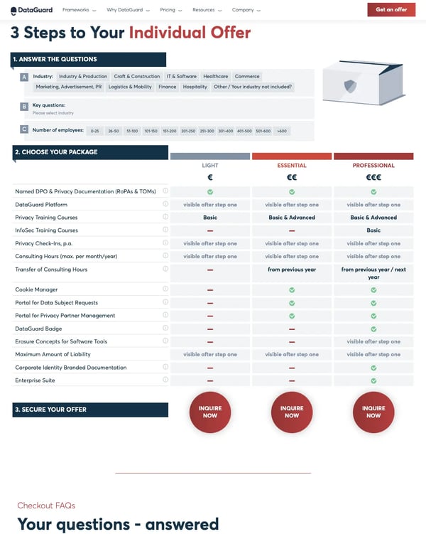
Dataguard's pricing page offers an interactive questionnaire to determine the package best for your organization and goals. The Dataguard pricing page also includes a benefit breakdown analysis, social proof, frequently asked questions, and many different CTAs to convert their audience.
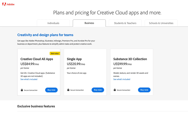
2. Adobe
Adobe delivers a clean, simple pricing page for users with pricing clearly stated. This is a very user-friendly pricing page and denotes which pricing plan they suggest through the 'best value' tag.
Rather than overwhelming this page with information, they segment by persona—individuals, businesses, students/teachers, and schools/universities—to connect directly with their personas.
Learn how to create user-friendly pages with our guide to five-second testing in UX.
3. Salesforce Marketing Cloud
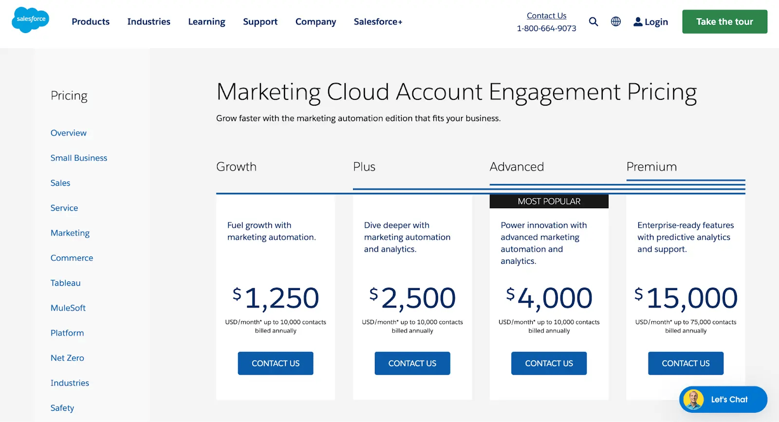
Salesforce Marketing Cloud’s pricing page includes concrete numbers (which users are looking for), and a 'Contact Us' CTA at the bottom of each pricing tier. They also speak in 'benefits' rather than 'features,' helping nurture prospects to convert and reinforce the value of their SaaS product(s).
They also include a 'most popular option, helping first-time customers understand which package might be best for them.
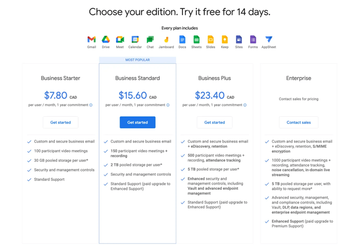
4. Google Workspace
Google uses intuitive design, lots of white space, and highlights the key value propositions across each pricing package. Their pricing page also includes graphical images of what's included with each plan and clear CTAs to get started once they determine what package customers want.
Optimize your value proposition with our free position survey template.
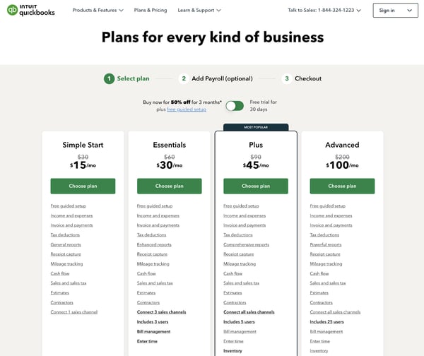
5. Intuit Quickbooks
Intuit's Quickbooks pricing page is unique—offering prospects three months at a 50% discount or one month free. This gives readers the ability to pick what works for them, in addition to the pricing tiers.
We also like that they have the payment steps outlined on the top—selecting your plan, adding payroll, and checkout—to make sure that prospects don't experience fatigue before getting to checkout.
Finally, Intuit uses great labeling options with 'Simple Start,' ‘Essentials,’ 'Plus,' and 'Advanced,' to easily attract the right audiences to the right packages. All in all, this pricing page is a hit!
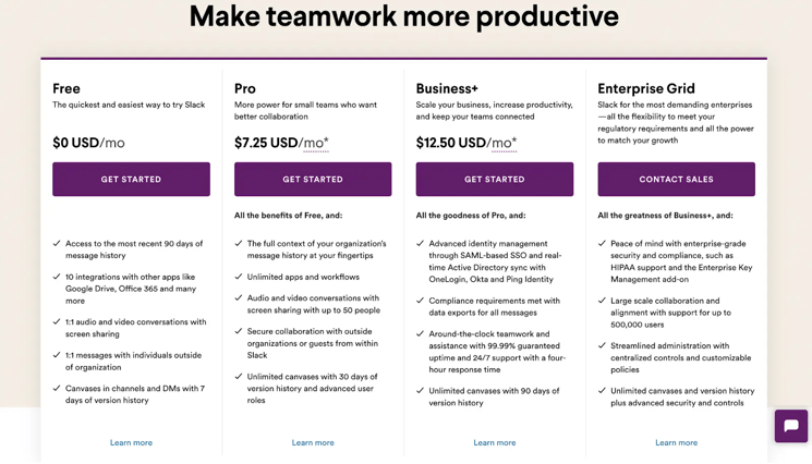
6. Slack
Slack's pricing page is wonderfully simple. With 'top features' and the price explicitly detailed. This makes for a scalable, transparent SaaS pricing model that's allowed Slack to become a leading communication platform.
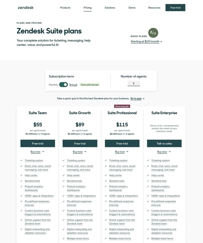
7. Zendesk
Known for their dedication to customer success, Zendesk's pricing page is intuitive and easy to use. They include a toggle option for enterprises at the top, include two CTAs per pricing tier, and plenty of information to inform prospects about their options.
ZenDeck's pricing page also includes a 'Most Popular' tag over their last package to reduce friction along the funnel even more.
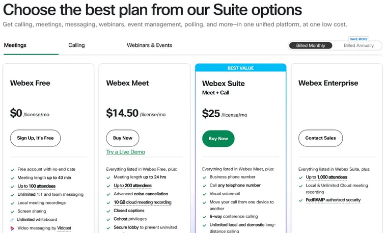
8. Cisco Webex
With a toggle for annual and monthly billing, a 'Best Value' tag, and product benefits organized into expandable categories, it becomes easy to find exactly what you need. It's simple and intuitive, yet contains everything relevant to a SaaS buyer as they navigate their options.
Cisco's pricing page is an excellent example of a high-converting, low-friction content and design.
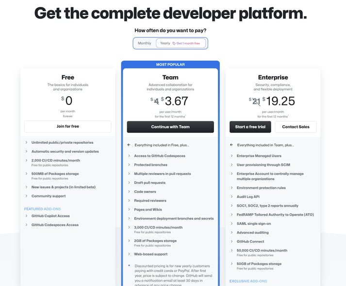
9. Github
This pricing page directly speaks to their primary persona—developers—and uses plenty of white space, with bright pops of color where they want to draw your eyes.
They also employ a variety of effective elements, such as a toggle for annual and monthly billing, a 'Most Popular' tag highlighted by an eye-catching border, product benefits organized into expandable categories, and multiple CTAs.
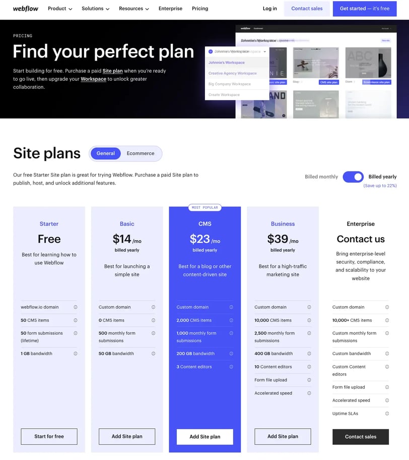
10. Webflow
This page immediately captivates the visitor with its use of bold and vibrant colors, complemented by an engaging headline and a visually dynamic banner.
Thoughtfully segmented, it caters to customers seeking either a general site plan or a specific E-commerce solution. The site's design isn't merely aesthetically pleasing; it's strategic as well.
Key features include a toggle for annual and monthly billing, a prominent 'Most Popular' tag highlighted in an eye-catching shade of blue, a clear outline of product benefits, and an expandable section detailing various features.
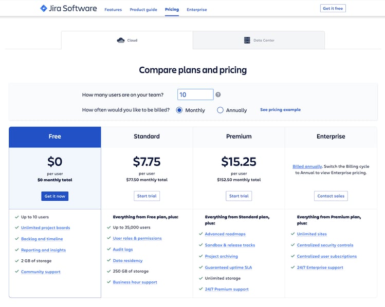
11. Jira
This SaaS pricing page follows all of the SaaS pricing best practices: your payment toggle at the top, your CTA embedded at each touchpoint, and a feature analysis by pricing tier.
What's more, they've included an option to input exactly what you'll be paying for your unique needs with the textbox above the toggle.
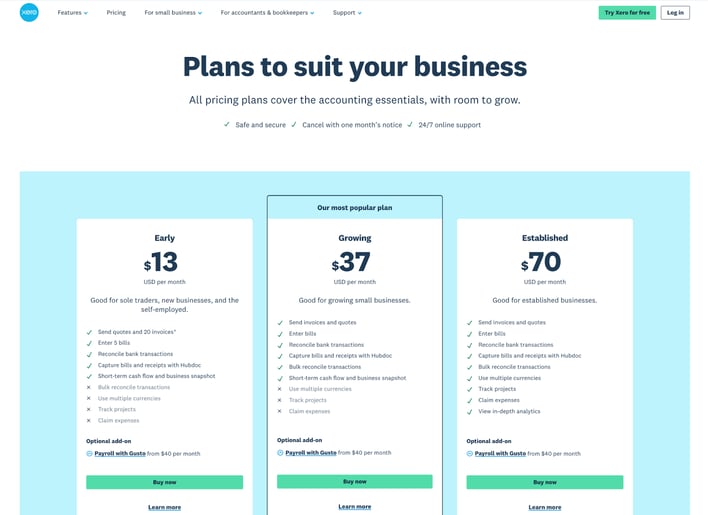
12. Xero
Xero’s pricing page leverages microcopy, iconography, and clear pricing options to indicate which audience each pricing plan is best for.
Xero also highlights the middle column as their most popular pricing plan and includes the option to learn more about the unique pricing plans. All in all, this pricing page suits Xero's products and offerings for SaaS buyers.
How To Know If My Pricing Page Is Effective?
Your SaaS pricing page is a key tool in converting visitors into paying customers. To determine if it’s performing effectively, start by analyzing your conversion rates.
If visitors aren’t signing up or upgrading, your page might not be clearly communicating the value of your offerings. Testing variations of your design, tier descriptions, and CTAs through A/B testing can help identify what resonates best.
High bounce rates can indicate that users are leaving your pricing page too quickly, often due to unclear messaging or overwhelming design. Tools like Google Analytics can reveal where visitors drop off, allowing you to streamline your layout or simplify your pricing structure.
User behavior analysis provides deeper insights.
Heatmaps and session recordings from tools like Hotjar or Crazy Egg can show where users hesitate, scroll, or click the most. For example, if users consistently click on non-interactive elements, it may suggest missing information or confusion that needs to be addressed.
Finally, seek direct feedback from your audience.
Use surveys, exit-intent popups, or follow-up emails to ask users why they didn’t convert. Their responses can highlight overlooked pain points or areas for improvement, helping you refine your pricing page for better results.
By monitoring these factors and making data-driven adjustments, your pricing page can become a high-converting asset that drives predictable growth.
Get Help With Your SaaS Pricing Pages
Your pricing page is a crucial part of your SaaS marketing strategy.
Intuitive design and clear copy are at the heart of an effective SaaS pricing page. If your SaaS prospects get stuck in the decision stage and don't convert, this may be caused by an ineffective or confusing pricing page.
Your pricing strategy can be your competitive advantage or your biggest downfall. And for SaaS start-ups in particular, evaluating and pinpointing your ideal customer profile's willingness to pay a concrete dollar amount takes years of testing.
Struggling to drive conversions from your SaaS pricing page? At Kalungi, we’ve helped B2B SaaS companies increase MQLs through optimized pricing strategies.
📩 Contact us today for a free consultation.

.webp?width=181&height=262&name=Guide%20-%20SaaS%20Pricing%20(2).webp)