Content Marketing
5 Content Marketing Rules in B2B SaaS Copywriting
When you write a blog, an email, or ad copy for your B2B SaaS company, some copywriting rules are easy to follow and can make a difference.


Silvia Parra
It doesn't matter how great your product is - if you can't get people to subscribe to it, it's worthless. For B2B SaaS companies, their website is the place where prospects form an opinion about your product, it's where your potential customers evaluate your software, and where they make constant decisions. To engage or to leave. To convert or to bounce.
That conversion can be in the form of a trial sign-up, a demo request, a contact us form submission, or it could also be in the form of a content download or a webinar registration. It all falls into the experience your ideal customer has with your website, from the user experience (UX) and user interface (UI), to the messaging, positioning, the call to action, and the value. The value you add, not only to where they are in the buyer's journey but to the experience they are having with your brand, through your website.
When you are first optimizing your website for conversions, you need to focus on one thing: research. And the primary object of that research should be your current customers. The understanding gained from this will reveal how they perceive your product and your brand and how you will address the issues they care the most about. Identifying the words they use is key, but what’s even more important is understanding their underlying pain points, beliefs, and feelings.
What's their job to be done? What do they complain about? What features do they focus on when talking about your product? The answer to these questions will help you structure your website in a way that speaks to your ideal customer and connects with them. The customer-centric language will make your audience feel you understand their pains, dreams, and fears. After all, customers want to see themselves on your website, so speak their language and make them the center of your copy.
Let's break down the website into the main strategic conversion pages:
The homepage for B2B SaaS companies is where you provide a compelling reason for visitors to stay and learn if the product/service is for them or not. Keep the value propositions clear. Your audience should be able to easily identify the value your product offers. Along with clear value propositions, the homepage should feature clear and strong calls to action (CTAs), making it easy for visitors to take action.
Social proof has always been among the must-have strategies of Conversion Rate Optimization (CRO) for SaaS companies, and the reason is simple: it helps to build trust and convince visitors that others like them trust and use your product. Social proof can come in the form of:
Slack, for example, does a great job of immediately making site visitors aware of the big brands using their service as soon as they enter the site.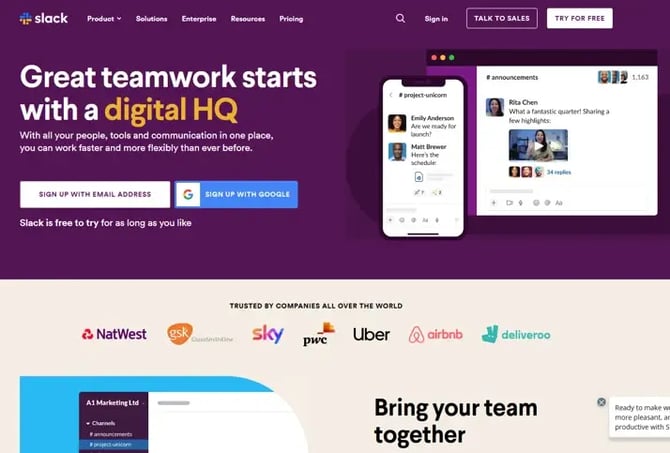
Scrolling a bit farther, visitors are then greeted by social proof around how satisfied their customers are with their offering and a video testimonial and quote to back up their claims with proof from real users.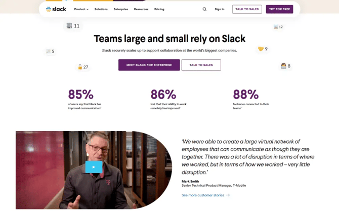
Note: Don't overwhelm your visitors with too much information. You are speaking to people, don't be pushy.
If after visiting the homepage, your website visitors are still interested in your product, they will probably need to see more insights in order to take any concrete action.
What's better than reading about your product's features? Watching it in action. A product demo/video is a great way to illustrate your messaging and bring the product experience closer to your prospects.
Make your features benefit-driven. When planning your Features Page, try to break down the technical jargon into simple language, illustrating the end-benefits users will receive with your product features. You can then back your claims with technical specifications to help highlight advantages and differentiate yourself from direct competitors.
The pricing page is the place on your website where prospects make the final decision. Help them choose. Visitors coming to the pricing page should be able to pick one plan instantly. Simplify the process by making it super easy for them to identify the one option that fits all their needs.
Put yourself in the shoes of your audience and answer the questions they might be asking in the FAQs section on the pricing page. Sales calls are a great place to identify questions prospects ask after they are introduced to the product. Questions around integrations, onboarding time, support, and even technical specifications are ideal to include in this section.
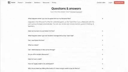 The Notion pricing page does a great job of provideing an extensive list of answers to potential questions a site visitor would have about their different plans, offerings, trials, cancellation policies, etc. to allow for total transparency and make the buyer feel confident in what they're signing up for when they purchase.
Something to avoid when building your pricing page is providing the visitor with unnecessary exit doors. One very old trick is to minimize navigation options or exit doors to avoid distractions on transaction pages that lead to the person leaving the page. An A/B test could be a good exercise to test this hypothesis with your own website visitors.
Online review is a great place to start your customer research. You can visit SaaS customer review sites like Capterra, G2, Software Advice, GetApp, and other technology review websites. But nothing beats speaking directly to your current customers, to the ones that have tried your product and stayed. There are two primary methods: surveys and interviews. I highly recommend doing recorded interviews so you can go back and listen again to catch what the tone, pauses, and verbiage reveals.
The best website is built to serve the site visitor in their journey, not the other way around. Make this clear by putting your ideal customer at the center of your messaging and by making it easy for them to take action.

When you write a blog, an email, or ad copy for your B2B SaaS company, some copywriting rules are easy to follow and can make a difference.
Syndicate your existing B2B or B2C content with 4 easy steps to increase your company's visibility, site traffic, and customer retention.

Learn the best practices to market your B2B SaaS company to the evergrowing Hispanic community in the U.S.