The Performance Trap: How Your Early Decisions Are Killing Your CMS Site
Aster Bodden
Relevant Contents
Share this article
Subscribe
Subscribe
Where performance starts to break down
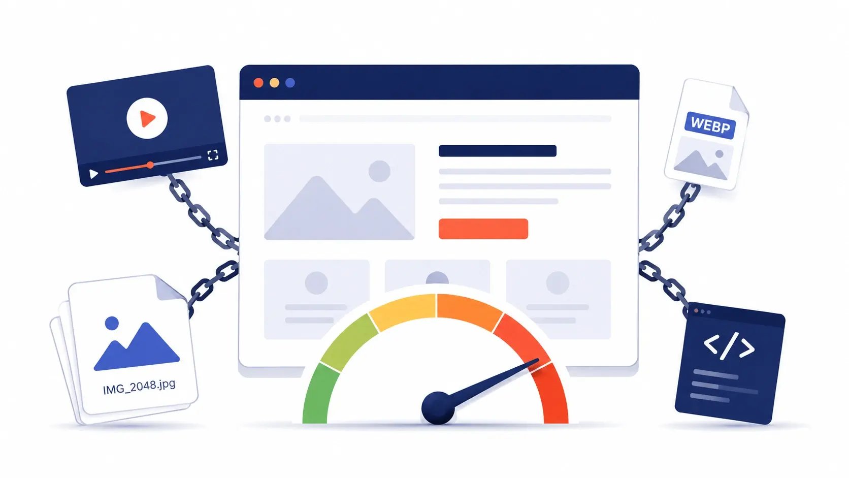
You chose a theme because it looked good in the demo.
You added a hero video because you think it converts better than a static image.
You trusted the CMS to handle your images.
You added analytics, chat, and a reviews widget because that's what everyone does.
None of those decisions felt risky. They all made sense at the time.
But each one was a performance decision pretending to be a content decision. And by the time something feels off, you're already locked in.
We've audited hundreds of sites, and the pattern is always the same. Teams build first and measure later. When scores start failing, they try to optimize their way out of it.
That only works to a point.
If the foundation wasn't built with performance in mind, optimization becomes damage control.
This post breaks down the decisions that hurt the most and how to make better ones next time.
Read What's Relevant to You
CMO or decision-maker Focus on the "What This Costs You" sections, then jump to the audit.
Marketer building pages Go straight to the "What You Should Do" steps. No coding required.
Developer or technical marketer Read everything. Developer notes go deeper on implementation.
Why Page Speed Is a Business Problem, Not Just a Technical One
Before getting into the decisions, it's worth being clear about what's actually at stake.
Google uses page speed as a ranking signal. Through Core Web Vitals, it measures how fast your pages load and how stable they feel to users. Sites that perform well get an advantage. Sites that don't get pushed down, even if the content is strong.
The three metrics that matter most:
LCP (Largest Contentful Paint): how long it takes for the main content to appear. Target under 2.5 seconds.
CLS (Cumulative Layout Shift): how much the page jumps while loading.
INP (Interaction to Next Paint): how quickly the page responds to user input.
If two pages are equally relevant, the faster one ranks higher. That makes performance more than a UX issue. It's a competitive advantage that compounds over time.
There's also a direct revenue impact. A one-second delay in load time can reduce conversions by around 7 percent ( Akamai performance research, widely cited in CRO literature). On mobile, where most traffic happens, the effect is even stronger.
1. Hero Videos: Worth It If You Handle Them Right
What's the problem?
Embedding a video isn't just loading a video file. It pulls in the entire player. Controls, scripts, tracking, event listeners. All of it initializes as soon as the page loads, even if the user never presses play.
What it does to performance
On a typical 4G connection, a YouTube or Vimeo embed can add 500 milliseconds to 1.5 seconds to LCP. That happens before your headline or CTA is fully visible.
On top of that, you're adding roughly 200 to 400KB of JavaScript that often loads before your content.
How this affects ranking
LCP is one of Google's primary ranking signals. A hero video above the fold is often the single biggest reason a page fails it.
What This Costs You
A slower LCP means lower rankings. Lower rankings mean fewer people even reach your page.
The video that was supposed to increase conversions ends up reducing visibility.
What You Should Do
Move the video below the fold. Let your headline and CTA load first. The experience stays the same, but performance improves immediately.
Or gate the video behind a button. Show a thumbnail with a "Watch video" trigger. Only load the player when the user asks for it.
Developer Notes
Use lightweight embeds like lite-youtube-embed. This reduces overhead dramatically by loading only a thumbnail until interaction.
For self-hosted videos, avoid preloading. Use lazy loading and include a poster image. In depth details here
How to Measure It
If your LCP is above 2.5 seconds and you have a hero video, test removing or gating it. You'll usually see an improvement of 0.5 to 1 second right away.
2. Images: Your Biggest Quick Win
What's the problem?
Images are the most common cause of slow marketing sites.
Most teams assume the CMS handles optimization. It helps, but not enough. A 1MB upload might still end up at 500KB after processing, which is still too heavy.
What it does to performance
A single 500KB hero image can add 1 to 2 seconds to LCP on mobile.
A blog listing page with ten 200KB images adds up to 2MB before any meaningful content loads.
That can mean 4 to 6 seconds of waiting on a typical mobile connection.
How this affects ranking
Images directly impact both LCP and CLS.
Large images slow down LCP. Missing dimensions cause layout shifts, which hurt CLS. Both are ranking signals, and both are fixable.
What This Costs You
A heavy hero image delays your headline by several seconds. Many visitors won't wait.
At the same time, Google sees the delay and ranks your page lower than faster competitors.
What You Should Do
Export images at 2x the size they’re displayed at. High-resolution screens (like retina displays) use more pixels in the same space, so If an image isn’t high enough resolution, those pixels get stretched and the image looks blurry.
Compress before uploading. Tools like Squoosh let you bring images down to around 150KB without visible quality loss.
Always define width and height. This prevents layout shifts.
Be especially careful on listing pages. Resize images to match their actual display size and aim for 60 to 80KB per image.
Developer Notes
Prioritize above-the-fold images so they load first. Lazy load everything else.
Use responsive image techniques to serve different sizes based on screen.
Avoid relying on CSS background images for important content.
resize_image_url is HubSpot's on-the-fly resizer. A marketer can drop a 3000px-wide hero photo into the blog editor without thinking about it, and this function tells HubSpot's CDN: "give me a version at exactly this width and height." HubSpot generates and caches that version once, then serves it forever. So instead of shipping the original upload, the browser receives a properly sized, properly shaped file. In this case, an 800×450 version goes into src. The fact that we pass both dimensions matters, because it locks the image to a 16:9 ratio, so the file the browser downloads is already pre-cropped to the shape the design needs.
srcset is the list of all the sizes we made available. The loop generates three resized URLs (400, 800, and 1200px wide), each labeled with its actual width (400w, 800w, 1200w). For each width, we calculate the matching 16:9 height with (w * 9 / 16)|round|int, so 400w is really 400×225, 800w is 800×450, and 1200w is 1200×675. Every file in the menu is a true 16:9 image. Think of srcset as a menu the browser can choose from. On its own, it doesn't pick anything; it just lists the options.
sizes is what tells the browser which option to pick. It does not resize the image. It describes how wide the image will actually render at each breakpoint, so the browser can grab the most appropriate file from the srcset menu. Reading our example top to bottom: on screens 1200px and wider, the image renders at 380px (the cards live in a 3-column grid that maxes out); between 768px and 1199px it renders at 50vw (a fluid 2-column layout, so each card is half the viewport); and on anything smaller it takes 100vw (full-width, cards stacked). The browser stops at the first matching rule, and the last value with no condition is the mobile fallback. An easier way to picture it: srcset is a coffee shop menu of cup sizes, and sizes is the customer saying "I need the small, I'm on the go." Without sizes, the barista has no idea what to pour.
src is the safety net. If a browser doesn't understand srcset (rare today, but it happens), it loads whatever is in src. Some browsers also fall back to the largest image in srcset when sizes is missing, which is another reason to always pair them together. Here we use the 800×450 version as a sensible middle ground.
width and height are critical for preventing CLS (Cumulative Layout Shift), that jarring effect where the page jumps as images finish loading. When the browser reads width="800" height="450", it knows the aspect ratio is 16:9 and reserves a correctly-shaped box for the image before it even starts downloading. The numbers don't lock the rendering size, because CSS is still in charge and the image can render at 380px or 50vw or whatever you want. What matters is the ratio: as long as width and height reflect the image's true aspect ratio, the browser scales the reserved space correctly and the page never jumps.
object-fit: cover in the CSS is the safety net for the marketer. HubSpot delivers the file at exactly 800×450 (and 400×225, 1200×675), but if a marketer ever uploads a portrait photo, HubSpot's resize can stretch it to fit those dimensions. object-fit: cover tells the browser to fill the 16:9 box and crop whatever doesn't fit, instead of distorting the image. Pair this with aspect-ratio: 16 / 9 and you've guaranteed every card looks consistent no matter what the marketer uploads.
loading="lazy" tells the browser not to download the image until the user scrolls close to it. Perfect for a blog index page where 10+ cards sit below the fold. One caveat: never use it on hero images or anything above the fold, since you want those loaded immediately.
decoding="async" is the one most people aren't sure about. After an image downloads, the browser still has to decode it, meaning turn the file bytes into pixels it can paint to the screen. By default the browser may pause other rendering work while it does this, and on a blog index page you've got many images decoding at once. decoding="async" is a hint that says "go ahead and keep painting the rest of the page; show this image whenever the decode finishes." For non-critical images like blog thumbnails, that's exactly what you want. The surrounding text and layout stay snappy and the images pop in a moment later instead of holding everything up.
Image Audit Checklist
☐ Images are under 150KB before upload
☐ Hero images end up under 100KB after processing
☐ Listing pages stay under 600KB total image weight
☐ All images include width and height
☐ Mobile load shows images bellow 2.5 seconds
3. Your Theme: The Problem You Can't Optimize Away
What's the problem?
A common situation looks like this.
You launch your site, run a speed test, and everything is red. You optimize images, remove scripts, and improve things slightly.
But it still feels slow.
Then you test a blank page with just text and a button. It's still slow. At that point, the issue isn't your content. It's the theme itself.
Why this happens
Themes are built to support every possible feature. Sliders, accordions, menus, animations. Even if you don't use them, the code is still there.
It's common for themes to load 150 to 300KB of CSS, with more than half unused on any given page.
How this affects ranking
Theme bloat affects every page on your site. It sets a baseline that everything else builds on.
If the baseline is slow, every page starts at a disadvantage.
What This Costs You
A heavy theme puts a ceiling on your performance.
Even if you optimize everything else, you won't reach strong Core Web Vitals scores if your foundation is slow.
And it's one of the hardest problems to fix later.
What To Do
Before choosing a theme, test it.
Check total CSS on a blank page. Aim for under 100KB.
Look at unused CSS. If more than half is unused, that's a warning sign.
If you're already on a slow theme, you have two options.
You can optimize within the constraint and accept a performance ceiling.
Or you can rebuild on a lighter foundation. It's harder upfront, but often pays off through better rankings and conversions.
Developer Notes
Measure CSS payload early.
Use setups that load styles per page or per component instead of globally.
If building custom, only include what each page actually needs.
This Is Where Atlas Comes In
At Kalungi, we built Atlas to solve the theme problem.
It's a HubSpot theme designed around performance from the start. Each page only loads what it needs, without unnecessary overhead.
Sites built on Atlas typically achieve strong Core Web Vitals scores because the foundation supports it instead of fighting it.
If performance matters, this is the kind of decision that makes everything else easier.
How to Audit Your Site in 5 Minutes
Step 1: Run PageSpeed Insights
Test your homepage using mobile. That's where performance issues are most visible.
Step 2: Understand your score
90 to 100 means you're in good shape
50 to 89 means there are clear opportunities
Below 50 usually points to deeper issues
Step 3: Identify the main issues
Common flags include:
Largest Contentful Paint element
Improperly sized images
Render-blocking resources
Unused CSS
Step 4: Separate quick wins from deeper problems
Images and video are usually quick fixes.
Unused CSS often points to a theme issue.
What To Do With Your Score
Above 70, focus on maintaining performance as you add content.
Between 50 and 70, prioritize images, scripts, and then review your theme.
Below 50, start with quick fixes but evaluate your foundation. You may be hitting a limit.
The Decision Framework: Performance Starts Before You Build
Why early decisions matter most
Most performance problems start during planning, not optimization. By the time you run your first audit, the decisions that hurt you most are already baked in. Three choices, made early, account for the majority of the damage we see in audits:
Choosing a heavy theme sets a slow baseline that every page inherits.
Adding a hero video adds immediate cost to your most important page.
Skipping image compression multiplies weight across every page on the site.
None of these are easy to undo later. That's why the checklist below is meant to be used before you commit, not after.
Quick Reference Checklist
Before choosing a theme
☐ Check CSS size on a blank page
☐ Look at unused CSS coverage
☐ Test the demo in PageSpeed Insights
☐ Confirm support for component-level loading
Before adding a video
☐ Decide if it's worth the performance cost
☐ Gate it behind interaction if possible
☐ Move it below the fold if unsure
Before uploading images
☐ Resize correctly
☐ Compress to around 150KB
☐ Set dimensions
☐ Keep listing pages lightweight
You can't optimize your way out of poor foundational decisions. But you can make better ones before they become a problem.
If you're building something new, ask how each choice affects performance before you commit.
If you're working with an existing site, images and video are your fastest wins. But if the theme is the issue, you may need to decide whether to work around it or replace it.
That's where we can help.
If your PageSpeed score is below 70 and you're on HubSpot, Atlas gives you a foundation that doesn't fight you.