3 Pillars for a great Marketing Dashboard
When managing marketing to outcomes and performance, you need a dashboard. You need to understand what’s happening today, what happened in the past, and how this can help you plan for the future.
While this is such a crucial part of Marketing Leadership, it's also something that’s often not done (well) or gets very time-consuming for the marketing team members. Here are a few tips to get you as the CMO started in the right direction.
1. Don’t confuse current state and historical performance
Most reports only show the current state of your business (how many leads are in the funnel right now, and how many opportunities). While this is helpful, it does not tell you how your business has been progressing over the past few months. You need historical reporting to provide those insights.
As a Marketing Leader, you basically need two types of reports:
- Reports showing you accurate data at a given moment in time, to answer the question “Where are we today?”
- Analytics based on historical snapshots to understand conversion rates, channel performance and plan for the future.
Pipeline vs. Funnel reporting
Let’s take a look at the following two reports. The first pipeline report shows the sum of all deals in each stage of the pipeline at the moment when the report is run.
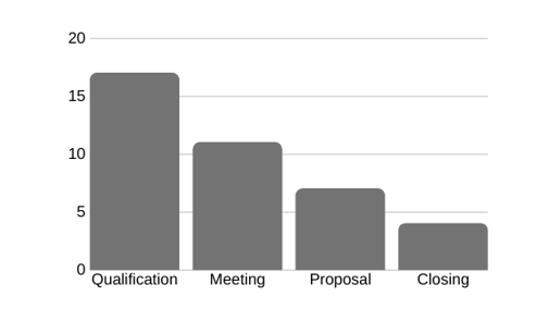 Pipeline reports like the above help keep track of the status of deals in the funnel and help understand whether you have an appropriate distribution of deals to meet the sales targets.
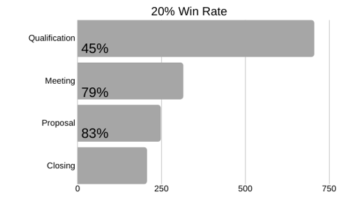
Now let’s look at the following funnel report, which represents the quantity and conversion rates of contacts as they travel through your pipeline stages. It’s called a “funnel” because of its shape: wide at the top as prospects enter, then increasingly narrow as they are disqualified or decide not to convert. Unlike a pipeline report, which shows the value and quantity of deals at the moment when the the report is run, a funnel report is based on a cohort. This means that a funnel report can tell you, for example, of the 100 leads you received last quarter, what percentage of them advanced through each stage of your pipeline.
 To produce a funnel report like this, and show accurate historical trends, you need to capture snapshots of your funnel data on a regular schedule.
While the first pipeline report answers the question of "Where are we today?", the second funnel report answers a question about what is happening over time.
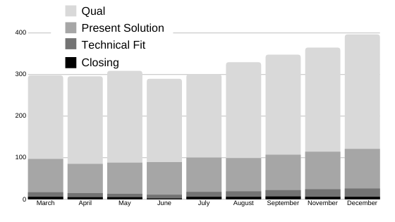
In the below third example, a combination of visualizations shows both a historical performance view and the state of the pipeline right now.
Create date vs. change date
We’ve seen above that tracking trends over time vs. operational reporting can be misleading. Another issue is related to showing the accurate state of a contact object over time. As you track for example a visitor who came to your website and want to understand if they became a lead or customer at some time, what date do you use to report? The date they became a visitor? Or the date they converted to a customer? This problem can get especially tricky when you use multiple CRM systems for Sales (Salesforce?), Marketing (Marketo?) and Services (Zendesk?). Integrated CRMs like Hubspot where the Marketing, Sales, and Services funnel is using one underlying CRM with a single contact object make this easier.
The challenge
A visitor comes to your website on Monday and converts to become a lead on Tuesday by filling out a form. Another visitor came to your website on Tuesday, and also became a lead on Tuesday. Do you want to show on your dashboard that these leads became leads on Tuesday? Or that these you got two leads, one who came to your website on Monday, and one that came to your website on Tuesday?
Example
Imagine you have the following data on visitors to your website:
.png?width=560&name=pipeline%20stage%204%20(1).png)
| DAY |
Monday |
Tuesday |
Wednesday |
Thursday |
Friday |
Saturday |
Sunday |
| Visitors |
8 |
11 |
9 |
10 |
4 |
0 |
1 |
| Cumulative |
8 |
19 |
28 |
38 |
42 |
42 |
43 |
So you know that 43 visitors came to your website in total, and on what day they visited.
Now let’s say you have an ability to identify visitors who took an action, let’s say they filled out a form, and are now considered a lead.
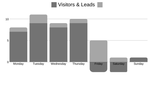
Your data could show the following:
.png?width=512&name=pipeline%20stage%205%20(1).png)
| FUNNEL |
Monday |
Tuesday |
Wednesday |
Thursday |
Friday |
Saturday |
Sunday |
| Visitors |
7 |
9 |
8 |
9 |
2 |
0 |
1 |
| Leads |
1 |
2 |
1 |
1 |
2 |
0 |
0 |
| Visitors+ Leads |
8 |
11 |
9 |
10 |
4 |
0 |
1 |
| Cumulative |
8 |
19 |
28 |
38 |
42 |
42 |
43 |
You could even answer the question “What was the conversion rate from visitors to leads every day” with the following table:
| FUNNEL |
Monday |
Tuesday |
Wednesday |
Thursday |
Friday |
Saturday |
Sunday |
| Visitors |
7 |
9 |
8 |
9 |
2 |
0 |
1 |
| Leads |
1 |
2 |
1 |
1 |
2 |
0 |
0 |
| Mix% |
14.29% |
22.22% |
12.50% |
10.71% |
100% |
|
0.0% |
Ok, so far this is pretty simple. The numbers all still add up. Now let’s throw a wrench into your report:
| FUNNEL |
Monday |
Tuesday |
Wednesday |
Thursday |
Friday |
Saturday |
Sunday |
| Visitors |
7 |
9 |
8 |
9 |
-1 |
-1 |
1 |
| Leads |
1 |
2 |
1 |
1 |
5 |
1 |
0 |
| Visitors + Leads |
8 |
11 |
9 |
10 |
4 |
0 |
1 |
| Cumulative |
8 |
19 |
28 |
38 |
42 |
42 |
43 |
| Mix % |
14.29% |
22.22% |
12.50% |
10.71% |
-500% |
|
0.0 |
What happened? Some visitors turned into leads on a later day in the week. Not only does this make the graph confusing with a negative number of visitors, it makes it harder to track which visitors (from what day) converted at what point, thus making conversion analytics less accurate.
The problem
A historical report with data snapshots is critical for marketing leaders to help them forecast MQLs based on subscriber sign-up volume and identify where leads are getting stuck so they can improve their process and better coach their team.
Solution
Operational reporting reports on the current state of a lead. This is what most CRMs do “out of the box. They don’t take historical snapshots into account. While advanced CRM systems like Hubspot and Salesforce solve for this with historical property data, there is an easy way to solve for this when you are just getting started as a CMO with a new team.
I recommend that every CMO starts with a simple tracker that they ask their team to fill out MANUALLY every week. Yes, you heard right….manually.
Building a MANUAL CMO dashboard
It’s very powerful to have someone actually manually enter a weekly number. It:
- Forces a deep understanding of the number (the source, the definition, the accuracy)
- It drives attention to the number (what can we learn from it?)
- It creates a powerful log of data that is not going to change because a tool from a 3rd party vendor changes.
Having the manual data in a spreadsheet allows you as the CMO to ask the following questions:
- Is the value of today’s pipeline bigger than before?
- How is the pipeline performing vs. last time?
- How are conversion rates performing?
- What’s the data quality? Is my CRM reporting the data consistently?
Not only do these questions always seem to repeat themselves, but they also can really drive confusion and delays as things are often made too complicated.
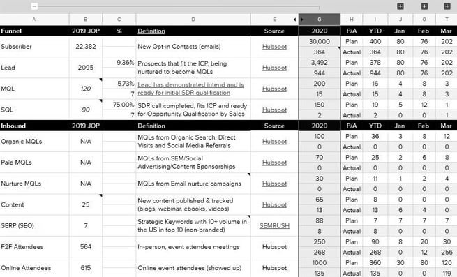
Here is a simple example of what your dashboard can look like. It uses Google Sheets, and a Kaizen/Bowler format to track actuals vs. plan.
2. Use B2B SaaS Marketing OKRs
Let’s finish with what to put on your Marketing Dashboard? How frequent? And how to use it?
Objectives and Key Results (OKRs) provide a great framework to achieve the above fundamentals. Here’s how they work:
- Objectives: Answer the “Why is this KPI important?” question.
- Key Results: Are typically measured in absolute numbers, and calculated vs. a quarterly target, that makes them strategic enough, while still tactical and related to the work done today.
- Actions (or Action-steps/Action-stats) should always support the Key Results. Measuring these weekly is a great way to work towards the quarterly Key Result goals.
Example
- Objectives: “I want to stay healthy, and bring down my risk to get diabetes”
- Key Result: “Lose 15 pounds to get to my healthy target weight of 220 lbs by the end of June”
- Actions:
- Walk at least 8000 steps every day
- Limit my calorie intake to 2500 calories per day
- Only eat a salad with chicken or fish for lunch, no starch.
- No food or flavored drink after 6 pm at night, just water.
Lagging and leading indicators
When you want to lose weight, looking at the weight scale every day is not likely to produce results. To impact outcomes, you likely will need to count calories, or how often you do a work-out. If you just look at the scale, results are likely to disappoint.
The same applies to a marketing dashboard. While the impact on meetings by the sales team, or revenue attributed to marketing campaigns are key to calculate ROI and long term success, they don’t help in managing day-to-day execution and accountability.
Measure both outcomes and activities/actions. While measuring impact low in the funnel (revenue, sales opportunities) is great to show the value of marketing, it does not help you assess what you’re team did last week. You need lagging indicators (Sales Qualified Leads, Meetings Happened) and leading indicators (Unique Visitors, Formfills) to tie to your team’s daily activities.
3. Keep it simple
- Don’t trust words or PowerPoint slides when it comes to marketing reporting. Only spreadsheets or simple graphs count.
- Only use meaningful KPIs - Ask yourself why you are measuring each specific KPI? When the numbers you measure go up and meet your targets, does that define success? If it’s underperforming, do you declare it a top priority to address?
- Use absolute numbers - Relative KPIs like percentages are great to benchmark conversion rates. Nothing beats the simplicity of an absolute number though, especially early in your marketing maturity journey, when you just want to drive understanding of the KPI, including trends, and minimize confusion.
- Have simple KPI definitions, including the measuring time period (I recommend weekly), and list the source of the number, that should be easy to retrieve.
Timing
Defining the start and end of a week is not trivial. Make sure this follows your team rhythm, and more importantly, how your systems report by default. This is all about making it easy. I like to ask my team to fill out the dashboard every Monday morning. It’s a good way to start the week with a focus on numbers and what to do about them as you set the week’s priorities. You can also choose to use the default dates of your CRM reporting platform. For example, Hubspot’s “week” runs from Sunday (first day) to Saturday (last day).